
Compute trends of temperature in R with EnvStats package
Introduction
Often in environmental studies we are interested in assessing the presence or absence of a long term trend. A widely applied is a parametric test for trend, which involves fitting a linear model that includes some measure of time as one of the predictor variables, and possibly allowing for serially correlated errors in the model. Instead of fitting the data to time series parametric test, Stephen Millard bundles several functions in EnvStats package that are non–parametric and agnostic in dealing with trend (Millard 2013).
These functions include kendallTrendTest()for computing annual trend and kendallSeasonalTrendTest() for computing the seasonal trends. One advantage of these tools is that are non-parametric test—trend test that does not assume normally distributed errors. In this post I will illustrate how to use these tools to assess the annual rate of change in temperature and precipitation for selected stations within the Zambezi river catchment.
Before we proceed, we need to load some packages that we are going to use in this post.
library(EnvStats)
require(tidyverse)
require(magrittr)
Data
We use download sea surface temperature data for Mafia Channel between January 2003 and July 2021. Semba and Peter (2020) developed a wior package, which interactively allow the user to dowload satellite data, process and organize them in long form to make it easy to manipulate and plotting in R. We can simply download the seas surface temperature for Mafia Channel by simply specifying the geographical extent of the channel and the period we are interested inside the et_sstMUR function. This chunk highlight the arguments required for this download.
sst = wior::get_sstMUR(lon.min = 38.7, lon.max = 39.2,
                       lat.min = -7.0, lat.max = -6.5,
                       t1 = "2003-01-01", t2 = "2021-07-30",
                       level = 2)
sst = sst %>%
group_by(time) %>%
summarise(sst = mean(sst, na.rm = TRUE)) %>%
write_csv("sst_mafia.csv")sst %>%
# sample_n(10) %>%
glimpse()Rows: 223
Columns: 2
$ time <date> 2003-01-16, 2003-02-16, 2003-03-16, 2003-04-16, 2003-05-16, 2003~
$ sst <dbl> 28.30728, 29.32974, 29.98218, 29.34222, 27.94531, 26.89597, 25.76~We notice that the dataset contains two columns and 223 observations. The columns include the time and sst values. The time is in perfect date format, we can visualize the temperature
sst %>%
  ggplot(aes(x = time, y = sst))+
  geom_path()+
  geom_smooth()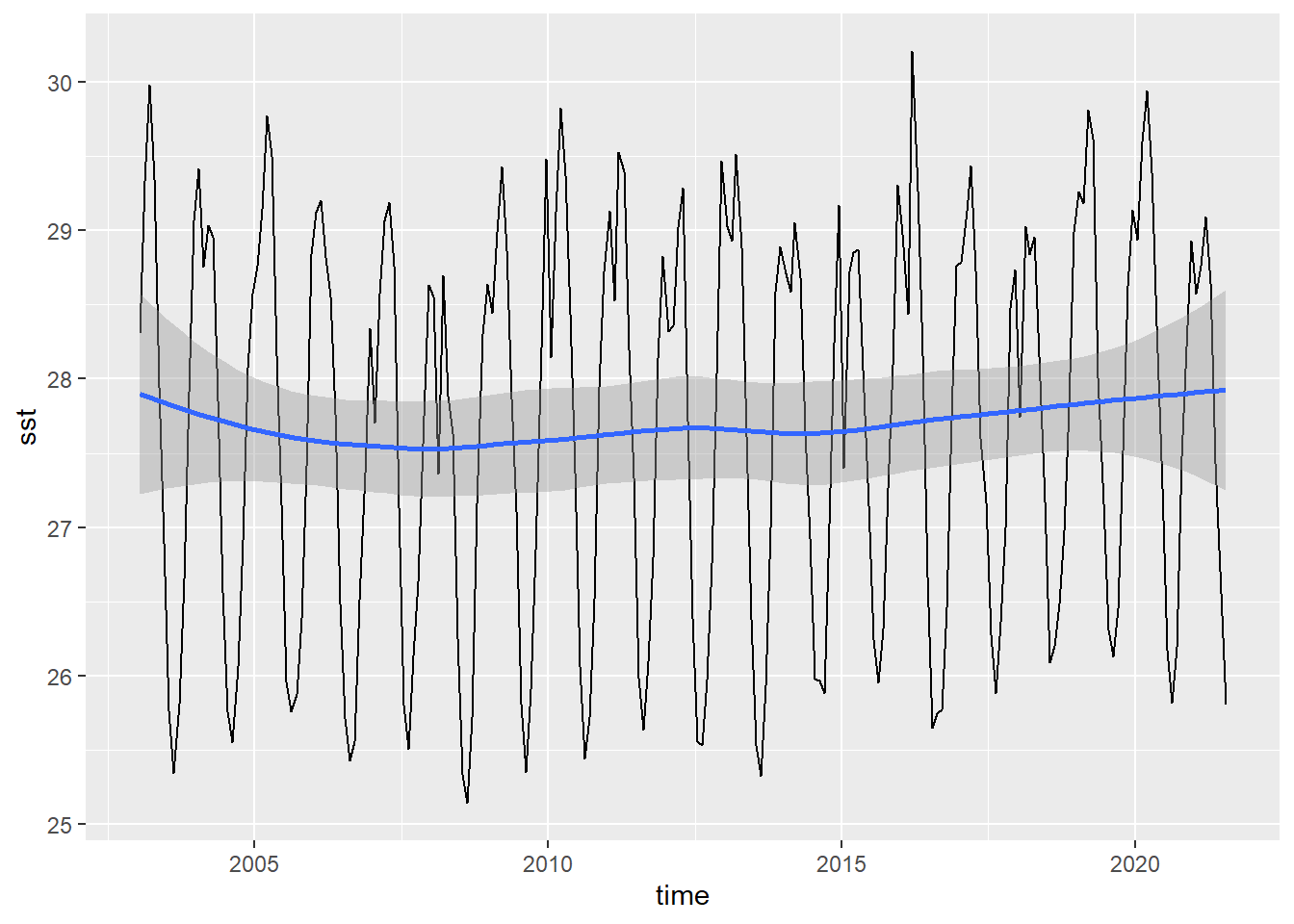
Annual Trend
We then need to understand the annual rate of change in temperature (trend) for the channel. We use the kendallTrendTest function from EnvStats package (Millard 2013) to assess whether temperature in Mafia channel experience positive or negative monotonic trends.
sst %>%
  mutate(year = lubridate::year(time))%$%
  EnvStats::kendallTrendTest(sst ~ year) %>%
  broom::tidy()%>%
  dplyr::select(tau = 1, slope = 2, statistic, p_value = 5)
# A tibble: 1 x 4
tau slope statistic p_value
<dbl> <dbl> <dbl> <dbl>
1 0.0555 0.0194 1.23 0.217We notice that Mafia has a monotonic increase of temperature at a rate of 0.019oC, which is insignificant (p = 0.23)
Seasonal trend
The mafia channel being located in the western indian ocean region is affected with the monsoon seasons. We may be interested to know also between southeast (SE) and northeast (NE) monsoon season, which one is warming faster than the other. The first thing is to decompose our dataset into the two monsoon seasons. We know from literature that the southeast monsoon season begin in may and run through September and northeast season begin in early October and end toward April. We can use this clues to separate the sst data into the two categories as the chunk highlight
sst.season = sst %>%
  mutate(year = lubridate::year(time),
         month = lubridate::month(time, label = FALSE),
         season = if_else(month >4 & month <10, "SE", "NE"))
Figure 1 highlight the key characteristic of the monsoon season, which is warmer during the NE and cooler during the SE monsoon season, the mean temperature of 28.54oC during the NE is significant higher than the mean temperature of 26.50oC during the SE monsoon season (p < 0.05).
sst.season %>%
  ggstatsplot::ggbetweenstats(x = season, y = sst, type = "p",
                              ylab = expression(SST~(degree*C)))+
  ggsci::scale_color_igv()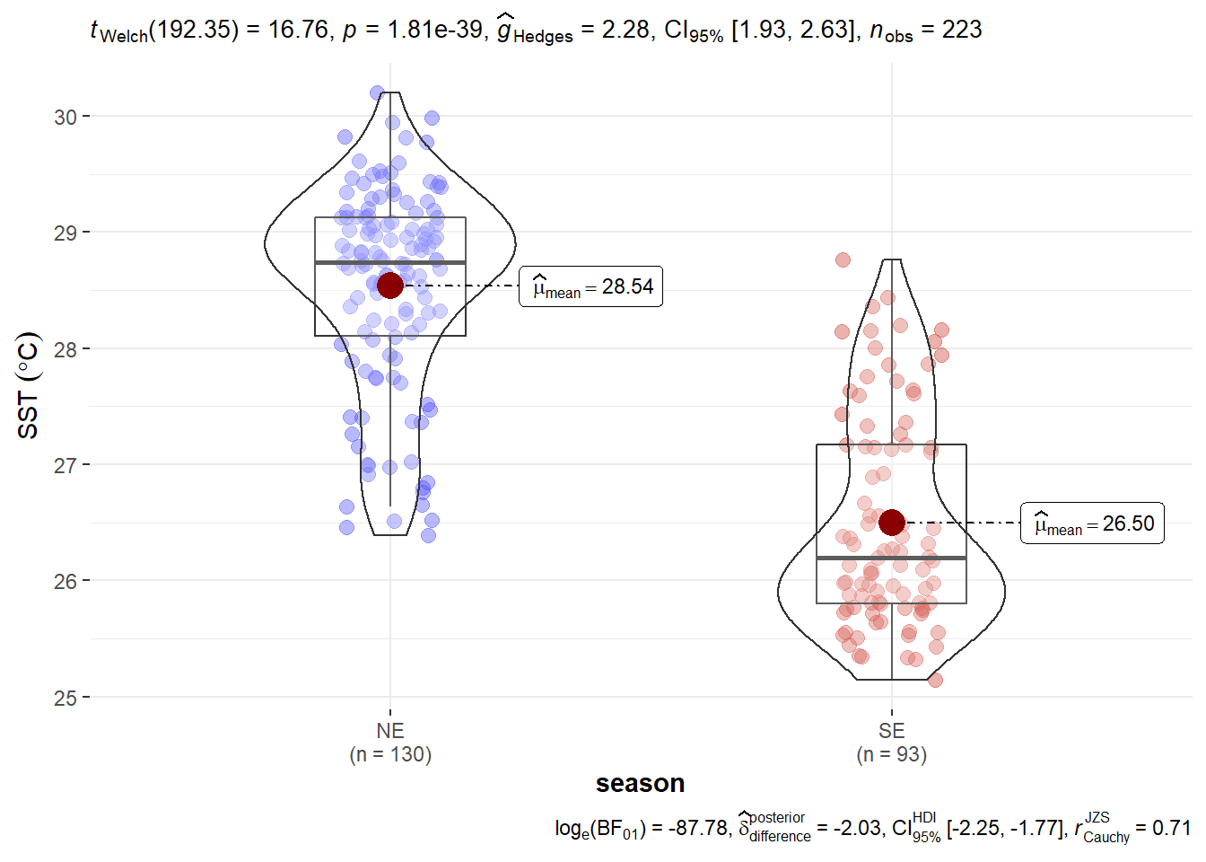
Figure 1: Sea surface temperature by season in the Mafia Channel
Once we are familiar with the seasonal characteristics of the sea surface temperature in the channel, we then go ahead and run the seasonal trend over the study period for the southeast monsoon
sst.season %>%
  filter(season == "SE")%$%
  EnvStats::kendallSeasonalTrendTest(sst ~ month+year) %>%
  broom::tidy()%>%
  dplyr::select(tau = 1, slope = 2, statistic, p_value = 5) %>%
  slice(1)
# A tibble: 1 x 4
tau slope statistic p_value
<dbl> <dbl> <dbl> <dbl>
1 0.254 0.0225 7.82 0.0982We found that sst trend in mafia increase at a rate of about 0.02oC per year during the SE monsoon season. Alghouth the rate of increase in temperature during the SE is higher than the annual trend, it’s insignificant.
sst.season %>%
  filter(season == "NE")%$%
  EnvStats::kendallSeasonalTrendTest(sst ~ month+year) %>%
  broom::tidy()%>%
  dplyr::select(tau = 1, slope = 2, statistic, p_value = 5) %>%
  slice(1)
# A tibble: 1 x 4
tau slope statistic p_value
<dbl> <dbl> <dbl> <dbl>
1 0.152 0.0162 6.33 0.387The NE experience the lowest rate of increase in temperature of 0.16oC per year expecting the temperature to rise by about 1.6oC in 100 years. We can further notice that the year 2008 was the coldest during the NE and SE monsoon season and the warmest year during the NE was 2019 and for SE was 2018 (Figure 2). The mean temperature difference between the cool and warm year in both NE and SE monsoon season were significant (p < 0.05).
sst.season %>%
  ggstatsplot::grouped_ggdotplotstats(x = sst, y = year,
                                      grouping.var = season,
                                      xlab = expression(SST~(degree*C)))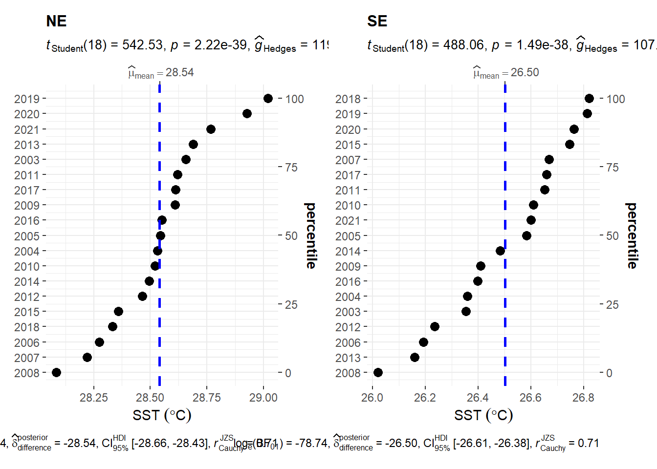
Figure 2: Dotplot of sea surface temperature in mafia channel by monsoon seasons
In summary, we have seen how to compute annual and seasonal trends of temperature. We have also seen how to present the result in both tabular form and plots, in form that is easy for the eye. That’s it for today and next post I will show how to compute seasonal trend using almost similar approach used in this post.
