Introduction to time series
In this post we demonstrate advanced two-dimensional visualization techniques in the form of graphical displays of the types of data typically encountered in oceanography, using R programming. The first example displays graphically a temperature and chlorophyll-a concentration time series for the last 20 years from acquired with MODIS satellite sensors.
We need some packages for this task loaded in the session. These packages can be loaded either using library or require functions. The chunk below highlight the list of packages that are loaded in this session.
require(tidyverse)
require(magrittr)
library(fable)
library(tsibble)
library(tsibbledata)
library(lubridate)
library(dplyr)
require(heatwaveR)
Specify geographical and time extend of our areas of interest
zones = tibble(
zone = c("eez", "pemba", "zanzibar", "mafia", "mtwara"),
lon.min = c(42, 38.98,38.67,39.06,39.64),
lon.max = c(42.8,39.5,39.4,39.84,40.6),
lat.min = c(-6.2, -5.35,-6.7,-7.98,-10.5),
lat.max = c(-4.7,-44.8,-5.8,-7.2,-9.7),
t1 = c("2003-01-01", "2003-01-01","2003-01-01","2003-01-01","2003-01-01"),
t2 = c("2019-12-31", "2019-12-31", "2019-12-31", "2019-12-31", "2019-12-31"))
Download satellite data
Chl-modis
data = list()

for (i in 1:nrow(zones)){
  sites = zones %>% slice(i)

  data[[i]] = sites %$%
  wior::get_chlModis(lon.min = lon.min, lon.max = lon.max,
                     lat.min = lat.min, lat.max = lat.max,
                     t1 = t1, t2 = t2, level = 3) %>%
    mutate(site = sites$zone)
}
Chl-seawifs
seawifs.data = list()

for (i in 1:nrow(zones)){
  sites = zones %>% slice(i)

  seawifs.data[[i]] = sites %$%
  wior::get_chlSeawif(lon.min = lon.min, lon.max = lon.max,
                     lat.min = lat.min, lat.max = lat.max,
                     t1 = "1997-09-16", t2 = "2010-12-16", level = 3) %>%
    mutate(site = sites$zone)
}
sst.modis
sst.data = list()

for (i in 1:nrow(zones)){
  sites = zones %>% slice(i)

  sst.data[[i]] = sites %$%
  wior::get_sstMODIS(lon.min = lon.min, lon.max = lon.max,
                     lat.min = lat.min, lat.max = lat.max,
                     t1 = "2003-01-01", t2 = "2019-10-16", type = 3) %>%
    mutate(site = sites$zone)
}
data %>%
bind_rows() %>%
mutate(source = "MODIS") %>%
write_csv("data/chl_modis.csv")Monthly average the data by site
chl.modis = vroom::vroom("data/chl_modis.csv")
chl.seawif = vroom::vroom("data/chl_seawifs.csv")
sst.modis = vroom::vroom("data/sst_modis.csv")
sst.series = sst.modis %>%
group_by(time, site) %>%
summarise(sst = median(sst, na.rm = TRUE))
chl.series = chl.modis %>%
group_by(time, site) %>%
summarise(chl = median(chlorophyll, na.rm = TRUE))
chl.series.seawif = chl.seawif %>%
group_by(time, site) %>%
summarise(chl = median(chlorophyll, na.rm = TRUE))Time series plots
Time series plotas are an excellent way to begin the process of understanding what sort of processed might have generated the data of interest. Traditionally, time series have beeen plotted with the observed data on the y-axis. Sequentially time points are usually connected with some form of line, but sometimes other plot forms can be a useful way of conveying important information in the time series (e.g., bAR_p_coeflots of sea-surface temperature anomolies show nicely the contrasting El Niño and La Niña phenomena).
ts objects and plot.ts()
The sst and chl-a are stored as data.frme objects, but we would like to transform the class to a more user-friendly format for dealingwith time series. Fortunately, the ts() functionwill do just that, and return an object of flass ts as well. In addition to the data themselves, we need to provide ts() function with three parameters.
data—a variablestart— specify the first sample in terms of (day, hour, year, month) etc. For example, our sst data are average on monthly since january 2003, then the start is writtenstart = c(2003,1).frequency— refer to the number of observation per cycle. For example if the data were collected each hour of a day, thenfrequency = 24and when the data are monthly average, thenfrequency = 12.
Our sst and chl time series of MODIS data frame are collected monthly and begin in January of 2003 where chl time series from SEAWIF sensor begin in September 1997. We pass these information to ts() function.
sst.ts = sst.series %>%
  filter(site == "eez") %>%
  select(-site) %$%
  stats::ts(data = sst, start = 2003, frequency = 12)
chl.ts = chl.series.seawif %>%
filter(site == "eez") %>%
select(-site) %$%
stats::ts(data = chl, start = c(1997,9), frequency = 12)chl.ts.modis = chl.series %>%
filter(site == "eez") %>%
select(-site) %$%
stats::ts(data = chl, start = c(2003,1), frequency = 12)Once we have created our object, now lets plot the ts object with plot.ts() function, which is designed specifically to handle ts objects.
chl.ts %>%
  plot.ts(las = 1, ylab = expression(Chl-a~(mgm^{-3})))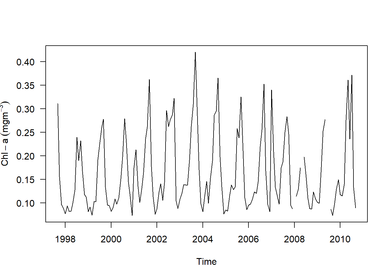
sst.ts %>%
  plot(las = 1, ylab = expression(SST~(degree*C)))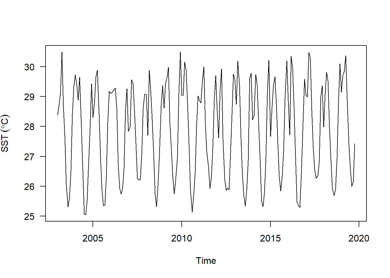
Combining and plotting multiple objects
Often times we compare variable of interest, for instance, we might be interested to compare sst versus chl concentration from MODIS data. To do that, we need to combine the two ts objects. Unfortunately, if we want to compare chl from seawifs and sst from modis, we have problem, because of time mismatch. Seawif chlorophyll-a start in September 1997 but sst data start in January 2003. We therefore, required to align the time indices of these two ts objects.
Fortunately, the ts.intersect function makes this really easy if you have the two dataset as ts objects by only include the observation with matching time stamps. Also a ts.union function does in similar fashion, but it pads one or both series with NA.
sst.ts %>%
  ts.intersect(chl.ts) %>%
  plot.ts()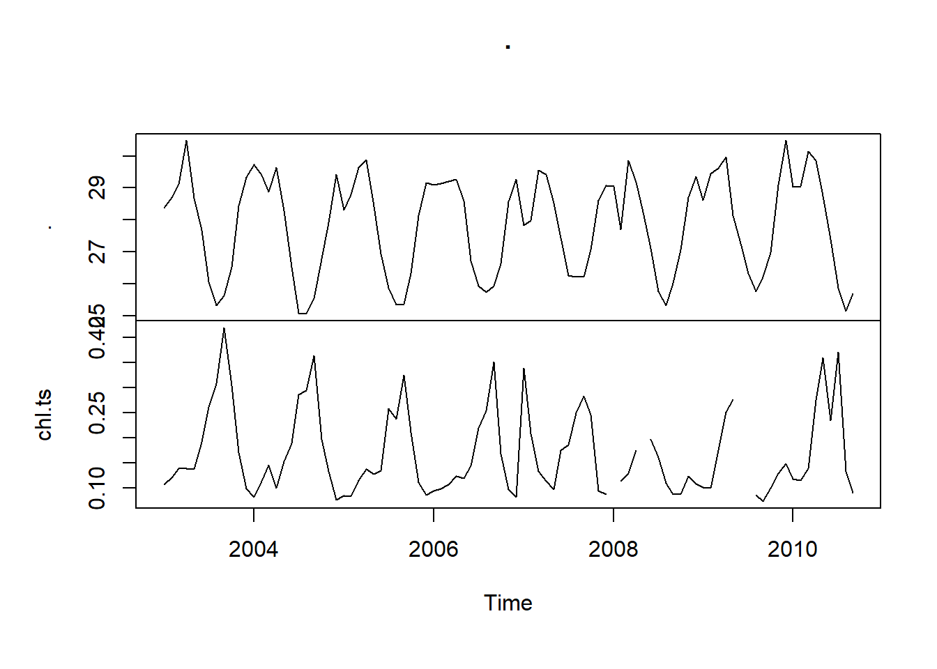
As you can see, the intersection of the two data sets only retain overlapping observations. Unlike the ts.intersect, ts.union pads the mismatch data with NA. If you compare them, you will find all mismatch data contains NA in both the sst and chl time series objects.
sst.ts %>%
  ts.union(chl.ts) %>%
  plot()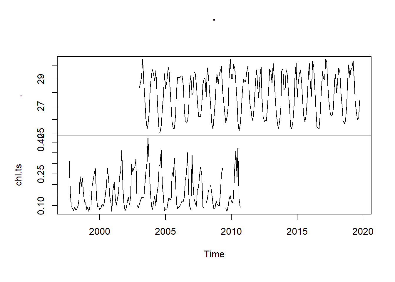
We also notice that plot function is smart to recognize ts object and use the information contained therein appropriately. The code in the chunk was used to plot the intersection of sst and chl-a time series together with the y-axes on alternate side.
sst.ts %>% ts.intersect(chl.ts.modis) %>% plot(las = 1, yax.flip = TRUE)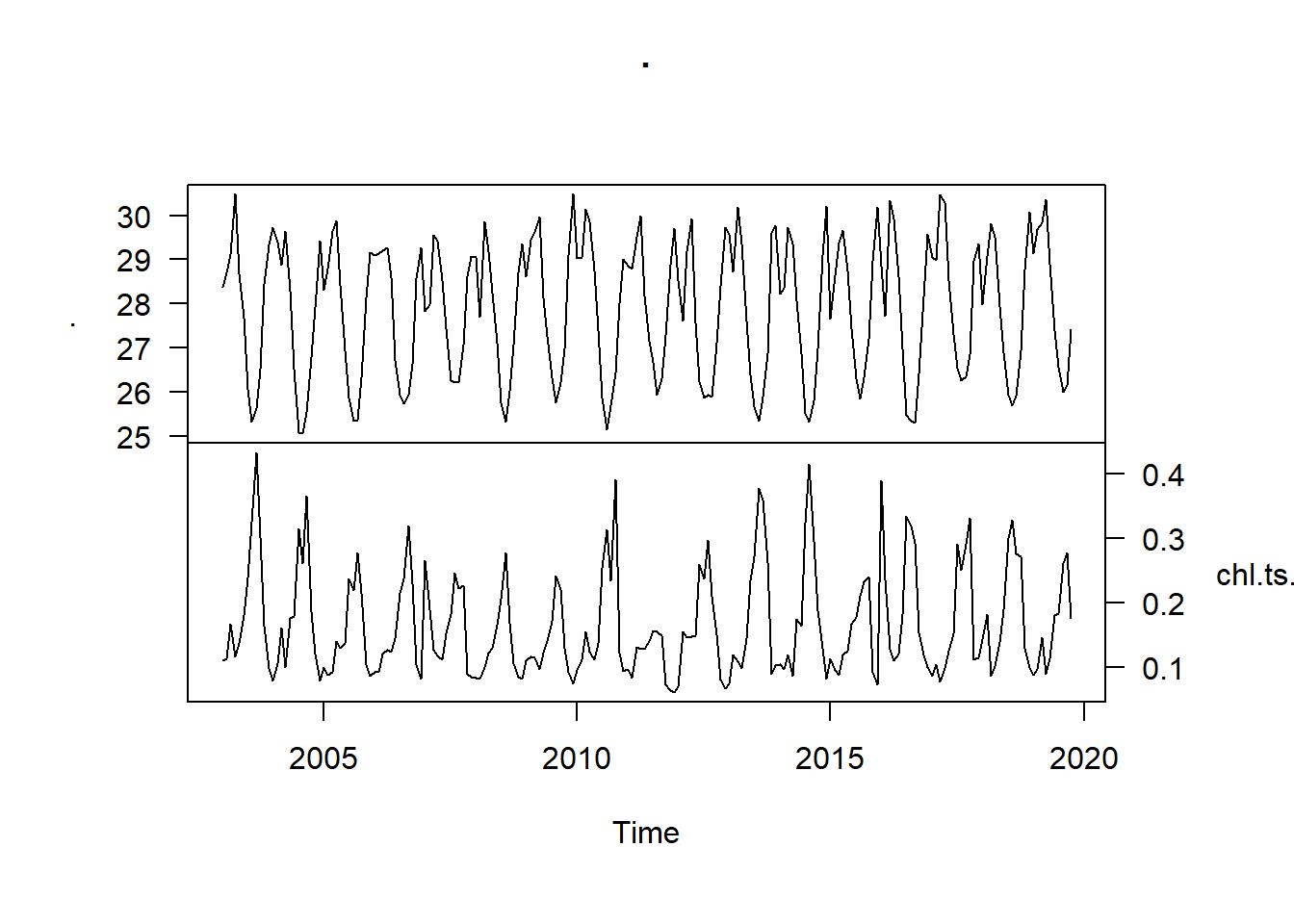
Figure 1: Time series of sea surface temperature (top) and the mean chlorophyll a concentration (bottom) in the EEZ of Tanzania measured monthly from January 2003 to December 2019
Decompose time series
Plotting time series data is an important first step in understanding the data. Beyond that, however, we need a more formal means for identifying and removing characteristics such as a trend or seasonal variation. Decomposing a time series means separating it into its constituent components, which are often a trend and a random components and if the data has seasonal influence, the seasonal component.
Decomposing trends
Decomposing time series try to separate the time series into these individual components. One approach to to this is using some smoothing method like simple moving average. The SMA function in TTR package can be used to smooth time series data using a moving average. This function takes a span arguments as n order. For instance, to calculate the moving average of order 5, we simply set n = 5. Let’s us start with n = 12 to see a clear picture of the sst time series trend component
sst.trend = sst.ts %>%
  TTR::SMA(n = 12)

sst.trend %>%
  plot()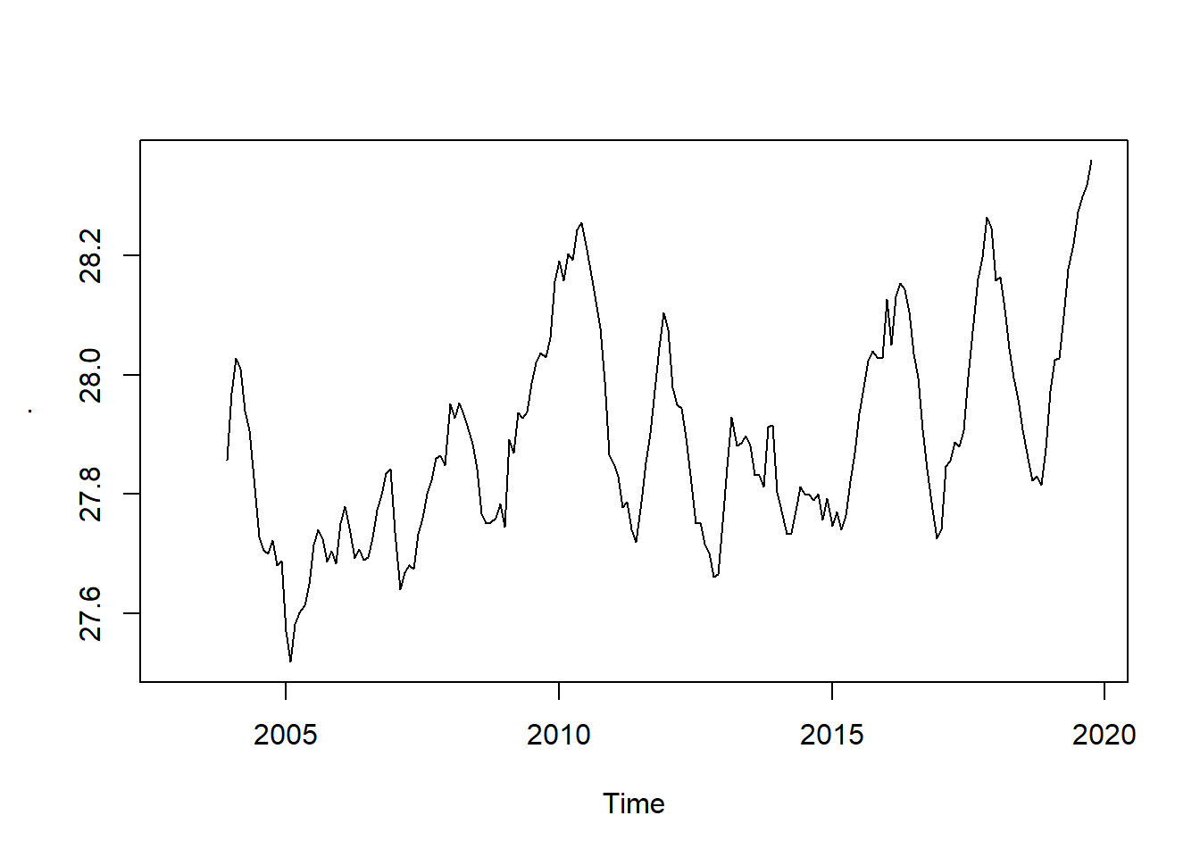
The trend is a more-or-less smoothly increasing function over time, the average slope of which does indeed appear to be increasing over time as well. Let us intersect the sst and trend ts object and plot them together
sst.ts %>%
  ts.intersect(sst.trend) %>%
  plot(las = 1, yax.flip = TRUE)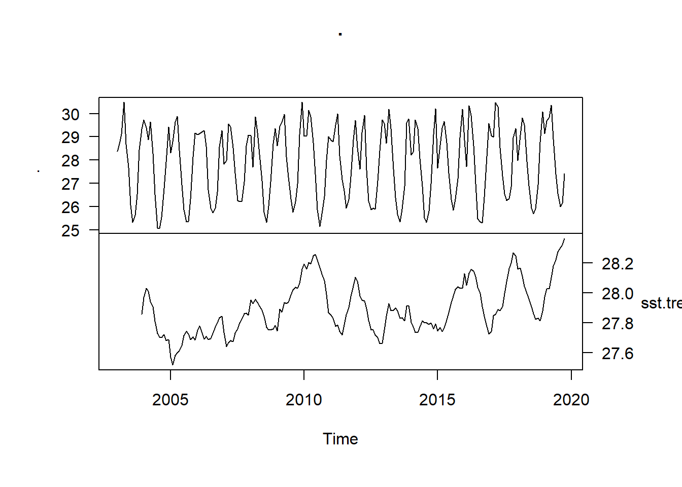
We see that the SST trend declined from 28 to 27.6 for a brief period, followed by a gradual increase in the subsequent years to
Decomposing Seasonal component
A time series, in addition to the trend and random component, also has a seasonal component. To obtain the time series components, we use decompose function from stats package to estimate trend, seasonal and random components of the time series objects.
sst.ts.decomposed = sst.ts %>%
  decompose()

sst.ts.decomposed %>%
  plot(yax.flip = TRUE)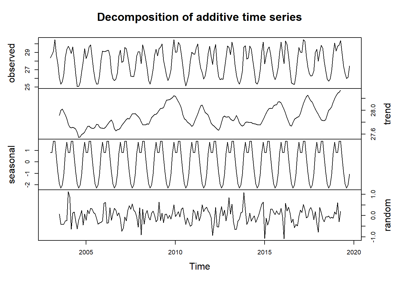
Seaonally adjusting
If you have a time time series, you can seasonally adjust the series by estimating the seasonal component, and subtracting estimated seasonal component from the original time series.We can simply do this using the estimate of the seasonal component calculated by the decompose() function.
For example, to seasonally adjust the time series of the sst per month in the EEZ, we can estimate the seasonal component using decompose(), and then subtract the seasonal component from the original time series:
sst.ts.decomposed = sst.ts %>%
  decompose()
sst.ts.season.adjusted = sst.ts - sst.ts.decomposed$seasonalWe can then plot the seasonally adjusted time series using the plot() function, by typing:
sst.ts.season.adjusted %>%
  plot(las = 1, ylab = expression(SST~(degree*C)))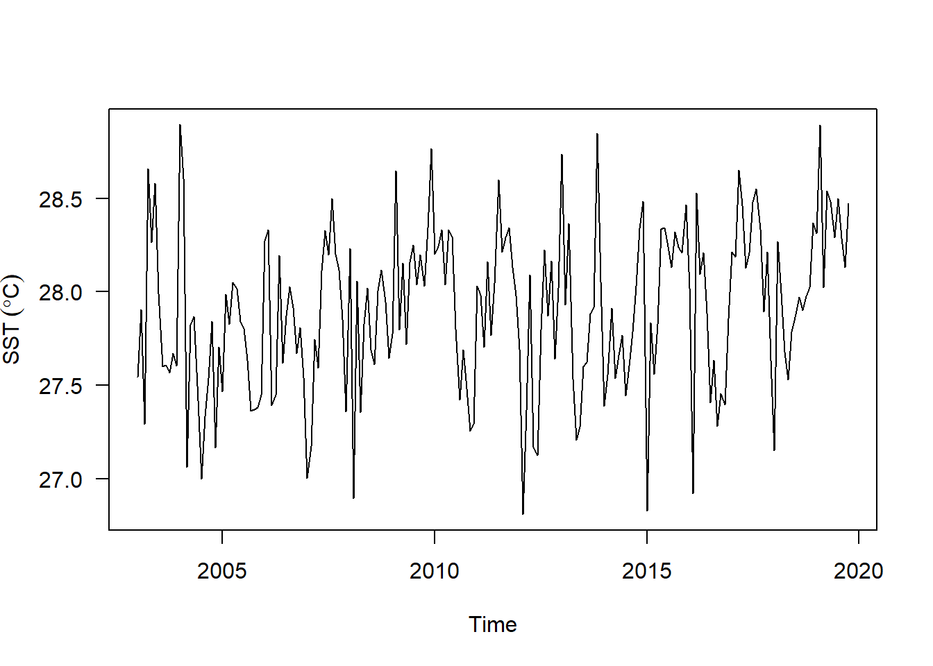
You can see that the seasonal variation has been removed from the seasonally adjusted time series. The seasonally adjusted time series now just contains the trend component and an irregular component.
Model
sst.ts %>%  tsibble::as_tsibble() %>%
  rename(sst = value, Month = index) %>%
  model(
    ets = ETS(box_cox(sst, 0.3)),
    arima = ARIMA(log(sst)),
    snaive = SNAIVE(sst)
  ) %>%
  forecast::forecast(h = "4 years") %>%
  autoplot()
aus_retail %>%
filter(
State %in% c("New South Wales", "Victoria"),
Industry == "Department stores"
) %>%
model(
ets = ETS(box_cox(Turnover, 0.3)),
arima = ARIMA(log(Turnover)),
snaive = SNAIVE(Turnover)
) %>%
forecast(h = "2 years") %>%
autoplot(filter(aus_retail, year(Month) > 2010), level = NULL)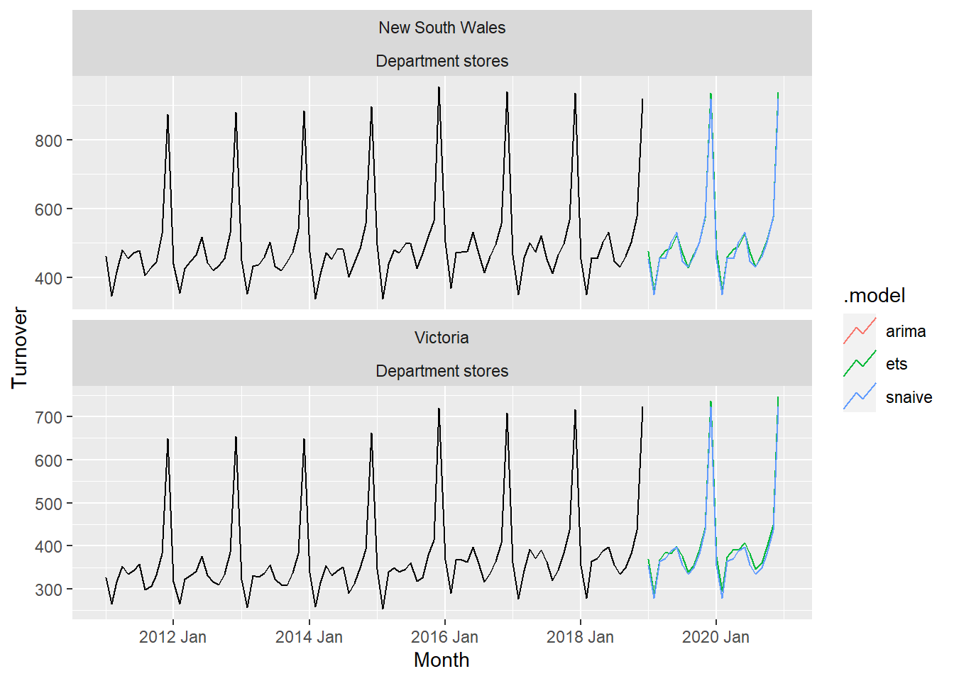
Heatwaves
pemba.daily.sst = wior::get_sstMUR(
  lon.min = 39.3,
  lon.max = 39.5,
  lat.min = -5.0,
  lat.max = -5.2,
  t1 = "2015-08-01",
  t2 = "2019-12-31")


pemba.daily.sst %>% write_csv("data/pemba_daily_sst.csv")
pemba.daily.sst = read_csv("data/pemba_daily_sst.csv")
pemba.sst = pemba.daily.sst %>%
group_by(time) %>%
summarise(sst = median(analysed_sst, na.rm = TRUE))
pemba.sst %>% FSA::headtail()FALSE time sst
FALSE 1 2015-08-01 26.435
FALSE 2 2015-08-02 26.596
FALSE 3 2015-08-03 26.064
FALSE 1612 2019-12-29 28.548
FALSE 1613 2019-12-30 28.704
FALSE 1614 2019-12-31 28.739Detect the events in a time series
ts.clim = pemba.sst %>%
  rename(t = time, temp = sst) %>%
  heatwaveR::ts2clm(climatologyPeriod = c("2015-08-01", "2019-12-31"))

pemba.mhw = ts.clim %>%
  heatwaveR::detect_event()
Visualising marine heatwaves (MHWs)
Default MHW visuals
One may use event_line() and lolli_plot() directly on the output of detect_event() in order to visualise MHWs. Here are the functions being used to visualise the massive Western Australian heatwave of 2011:
pemba.mhw %>%
  event_line(metric = "intensity_mean",
             spread = 60,
             start_date = "2019-01-01",
             end_date = "2019-03-31")+
  scale_y_continuous(breaks = seq(27,31,.5)) +
  theme(legend.position = c(.025,.85))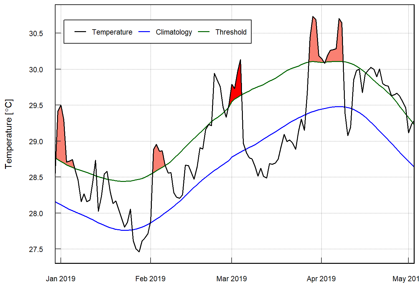
pemba.sst.ts =  pemba.sst %$%
  ts(data = sst, start = c(2015,8), frequency = 365.25)

pemba.sst.decompose = pemba.sst.ts %>%
  decompose()

pemba.sst.decompose %>%
  plot(yax.flip = TRUE, las = 1)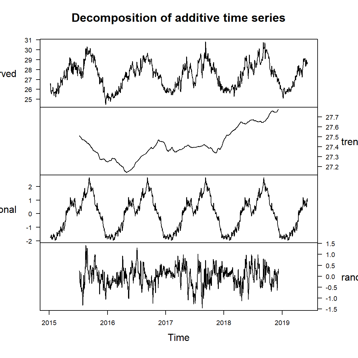
seasonal.adjusted = pemba.sst.ts -pemba.sst.decompose$seasonal

seasonal.adjusted %>%
  plot()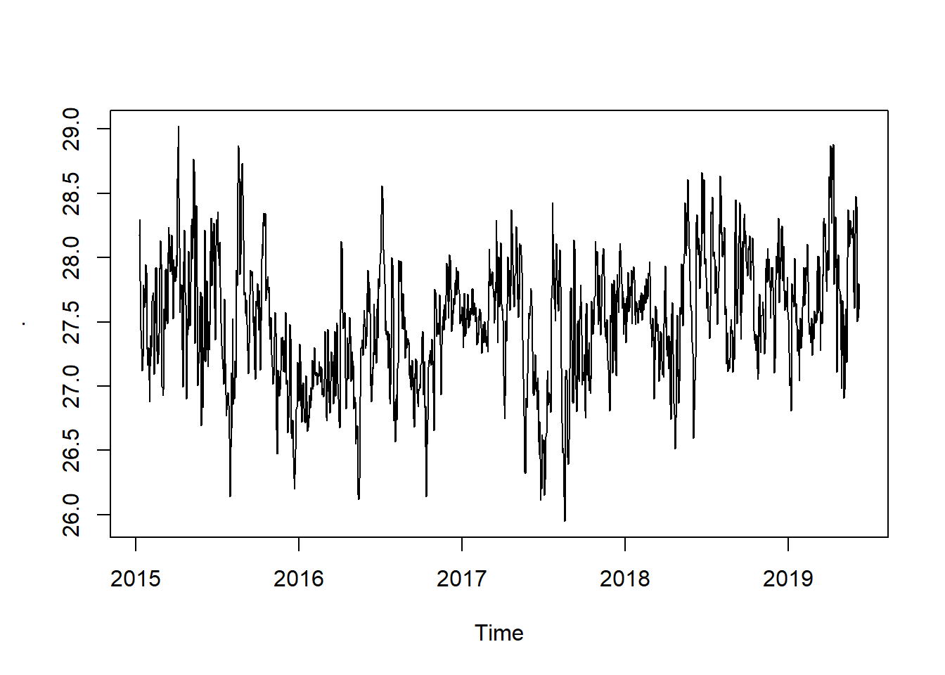
pemba.splits = pemba.daily.sst %>%
  filter(time > "2016-08-01") %>%
  mutate(miezi = lubridate::month(time), mwaka = lubridate::year(time)) %>%
  group_by(miezi, mwaka) %>%
  summarise(sst = median(analysed_sst, na.rm = TRUE)) %>%
  ungroup

pemba.splits %$%
  EnvStats::kendallTrendTest(sst ~ mwaka) %>%
  broom::tidy()%>%
  slice(1)
FALSE # A tibble: 1 x 7
FALSE estimate1 estimate2 estimate3 statistic p.value method alternative
FALSE <dbl> <dbl> <dbl> <dbl> <dbl> <chr> <chr>
FALSE 1 0.156 0.286 -550. 1.49 0.136 "Kendall's Test f~ two.sidedpemba.splits %>%
mutate(season = if_else(miezi %in% c(10:12,1:4), "NE", "SE")) %>%
filter(season == "SE")%$%
EnvStats::kendallTrendTest(sst ~ mwaka)FALSE
FALSE Kendall's Test for Trend (with continuity correction)
FALSE
FALSE data: sstmwaka
FALSE z = 1.4654, p-value = 0.1428
FALSE alternative hypothesis: true tau is not equal to 0
FALSE sample estimates:
FALSE tau slope intercept
FALSE 0.2573529 0.1980000 -373.4800000pemba.splits %>%
mutate(season = if_else(miezi %in% c(10:12,1:4), "NE", "SE")) %>%
filter(season == "NE")%$%
EnvStats::kendallTrendTest(sst ~ mwaka)FALSE
FALSE Kendall's Test for Trend (with continuity correction)
FALSE
FALSE data: sstmwaka
FALSE z = 1.6847, p-value = 0.09205
FALSE alternative hypothesis: true tau is not equal to 0
FALSE sample estimates:
FALSE tau slope intercept
FALSE 0.2391304 0.3310000 -639.8370000meteo =wior::get_meteo(coastal_codes = 2,begin_year = 2016, end_year = 2020)
meteo %>% tidyr::drop_na(air_temp)chl.ts.modis %>%
tseries::adf.test() %>%
broom::tidy()FALSE # A tibble: 1 x 5
FALSE statistic p.value parameter method alternative
FALSE <dbl> <dbl> <dbl> <chr> <chr>
FALSE 1 -7.68 0.01 5 Augmented Dickey-Fuller Test stationarypemba.splits %>%
mutate(season = if_else(miezi %in% c(10:12,1:4), "NE", "SE")) %>%
filter(season == "NE")%$%
EnvStats::kendallTrendTest(sst ~ mwaka)FALSE
FALSE Kendall's Test for Trend (with continuity correction)
FALSE
FALSE data: sstmwaka
FALSE z = 1.6847, p-value = 0.09205
FALSE alternative hypothesis: true tau is not equal to 0
FALSE sample estimates:
FALSE tau slope intercept
FALSE 0.2391304 0.3310000 -639.8370000chl.series %>% FSA::headtail()FALSE time site chl
FALSE 1 2003-01-16 eez 0.11058200
FALSE 2 2003-01-16 mafia 0.91594750
FALSE 3 2003-01-16 mtwara 0.13639300
FALSE 1018 2019-12-16 mtwara 0.08805725
FALSE 1019 2019-12-16 pemba 0.28579274
FALSE 1020 2019-12-16 zanzibar 0.39883378# sst.seriesMultiple ts
sst.df.wide = sst.series %>%
ungroup() %>%
# rowid_to_column()
pivot_wider(names_from = site, values_from = sst)
chl.df.wide = chl.series %>%
ungroup() %>%
# rowid_to_column()
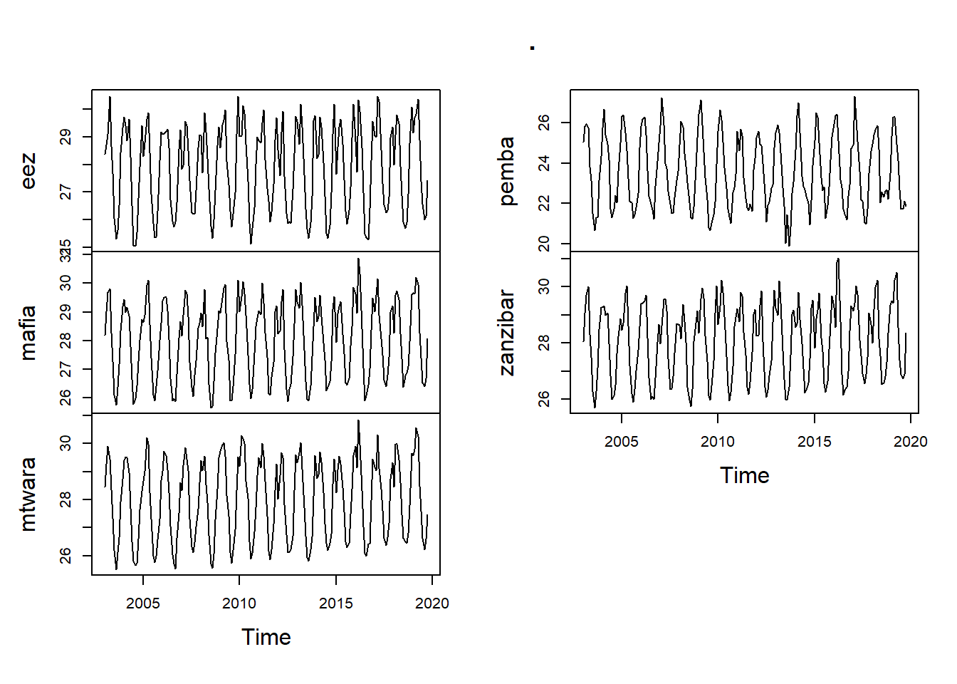
pivot_wider(names_from = site, values_from = chl) sst.wide.ts = sst.df.wide %>%
select(2:6) %>%
as.matrix() %>%
ts(start = c(2003,1), frequency = 12)
sst.wide.ts %>%
plot()